


In my initial days of learning CSS, I use the "px" unit everywhere in my CSS. But with time by watching many youtube tutorials I shifted from using "px" to "rem". The reason for using "rem" is that it is a relative unit whereas "px" is an absolute unit.
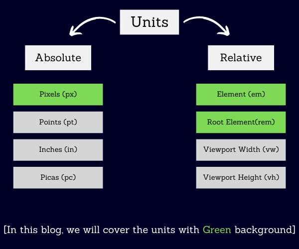
So, there are 2 types of units:
Absolute Units: These units do not change with respect to anything but rather remain the same.
Relative Units: These units change with respect to something. This something can be the parent element's font size or the size of the viewport.
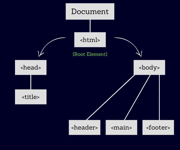
Before discussing "rem" and "em", I would like to discuss the root element.
Root Element:
The <html> element is the root element. Also called a top-level element.
Root Element(rem) unit:
The "rem" unit is a relative unit which means it changes with respect to something. Here this "something" is the font size of the root element.
By default, the font size of the root element is "16px".
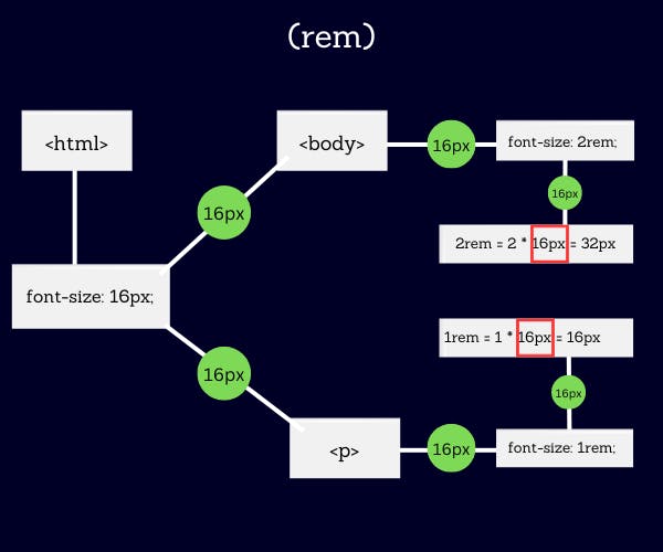
Element's value in (rem) = Value * (font-size of the root element)
Sometimes, it seems difficult to calculate "rem" units due to the root element's font size being "16px". So, to avoid this situation we can override the value of the root element's font size to "10px".

Element(em) unit:
The "em" unit is a relative unit which means it changes with respect to something. Here this "something" is the font size of the parent element or font size of the element itself.
I know "em" is a little bit confusing unit. As it changes its respect depending on where the unit is being used.
- When using "em" in (Typographical Properties) font size:
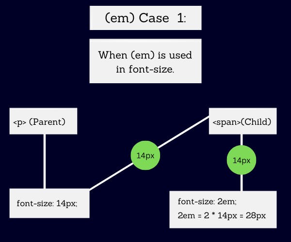
Element's value in (em) = Value * (font-size of the parent element)
- When using "em" in the margin, padding, width etc:
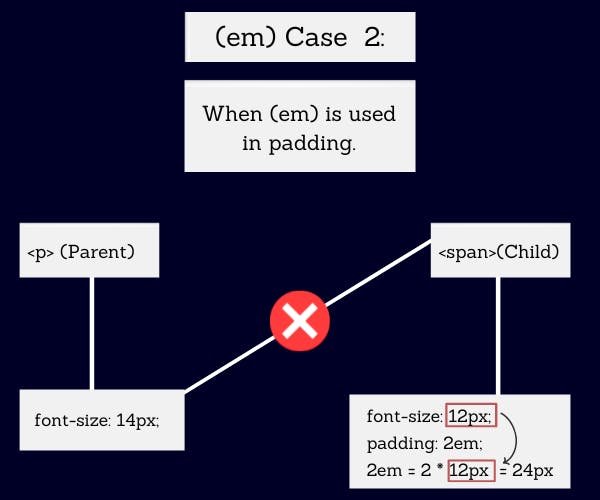
Element's value in (em) = Value * (font-size of the element)
I think up till now you may have understood the mechanism of the "rem" and "em" unit.
But the most important thing is where to use which unit. I will provide a few cases where I use "rem" and "em" instead of just using "px".
Where to use "em"?
I generally use "em" units with buttons.
Different devices(mobile, tablet, desktop) have different font sizes. Also, the buttons in different devices also have different font sizes. Due to this, variation in font sizes, there exists some inconsistency in UI if we use the "px" unit in padding.
- The following example uses the "px" unit in padding in different media:
<button class="btn mobile-btn">Click Me</button>
<button class="btn tab-btn">Click Me</button>
<button class="btn desktop-btn">Click Me</button>
/* CASE 1: USing (px) unit: */

.mobile-btn {
  font-size: 12px;
  padding: 8px 14px;
}
.tab-btn {
  font-size: 14px;
  padding: 8px 14px;
}
.desktop-btn {
  font-size: 16px;
  padding: 8px 14px;
}
We can see in the image below that padding of the button element does not change rather it is fixed which gives rise to inconsistency in button's UI.
We can fix this by giving each button different padding but that will result in a lot of time, code and effort.

- The following example uses the "em" unit in padding in different media:
.mobile-btn {
  font-size: 12px;
  padding: 0.6em 1.5em;  /* 0.6em = 0.6 * 12px = 7.2px */
}                        /* 1.5em = 1.5 * 12px = 18px  */

.tab-btn {
  font-size: 14px;
  padding: 0.6em 1.5em;  /* 0.6em = 0.6 * 14px = 8.4px */
}                        /* 1.5em = 1.5 * 14px = 21px  */

.desktop-btn {
  font-size: 16px;
  padding: 0.6em 1.5em;  /* 0.6em = 0.6 * 16px = 9.6px */
}                        /* 1.5em = 1.5 * 16px = 24px  */
We can see in the image below that the padding of the button element changes with respect to the change in the font size of the button element which maintains the consistency in UI. Also, it reduces code and time by automatically adjusting the padding value as per font size in different media, making it more responsive.

So, the conclusion is, it is better to use "em" in padding in case of a button rather than using the "px" unit, to make it more responsive and consistent.
Where to use "rem"?
"rem" should be used with typographical properties like font size. As "rem" unit changes with respect to the font size of the root element.
So whenever in the future we want the font sizes of our website to scale 2 times then we can mutate the value of the font size of the root element instead of just making changes in each font-size property of every element which we have to do in the case of using px as a unit in font size.
Conclusion:
I know that's not a lot of use cases of "em" and "rem". But the purpose of this blog is not to mention every use case but to give you clarity about "rem" and "em" and generally where I use them and why. And I am nowhere saying that using "px" is always bad. Every unit has its best use somewhere, but it depends on us whether we are able to identify the best use case.
I hope you enjoy reading the blog 😊 and got some insight into "em" and "rem".